

By The Pollack Group
At the 2019 B2B Marketing Expo in Los Angeles, a hub for the latest marketing innovation, there were sessions that covered everything from branding to technology and facilities management.
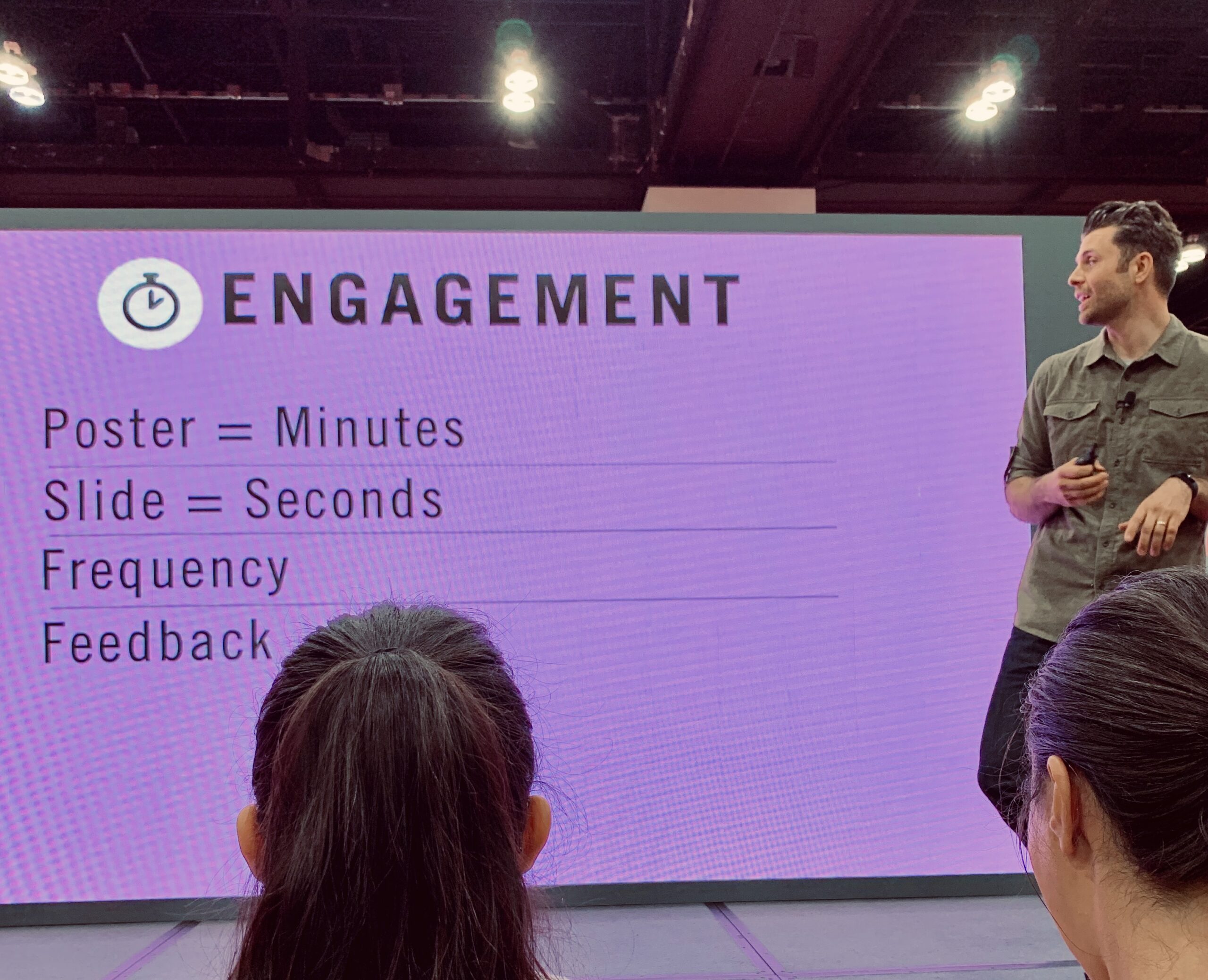
One session that stood out from all the others was on Data Storytelling.
Whether it be a quarterly report or a new product presentation, data can be a game-changer when it comes to internal and external communication for a company, brand or influencer. Just remember, numbers don’t lie. Data can help to predict success for a marketing strategy or serve to analyze the results during, and after, a campaign. It can turn successes and failures into tangible numbers and bottom-line takeaways, which is crucial for any revenue-driven business.
But here’s the problem – data by itself can be dull, and potentially confusing and off-putting. You need a way to use data to convey your unique advantage. Enter data visualization.
More than 65 percent of the population are visual learners, meaning they process information best when it’s presented through images. Just as a retailer on Amazon would (almost) never try to sell their products without pictures of those products, marketers substantially weaken their sales argument when they lack visuals.
But making data pretty doesn’t make a presentation compelling. What makes it compelling is a clear story, amplified by data. And that’s exactly what Nike’s Lead Design Strategist, Tim Degner, presented in his session at the expo.
Presenting proof points in a visual context where you clearly indicate a journey with a beginning and end point—like a bubble cloud, radial tree, or heat map— gives your target audience a clear picture of their needs and status. The more complex the data you’re presenting, the more useful data visualization with storytelling is in reinforcing your narrative.
Here are additional key takeaways from the session:
Data Storytelling is Akin to Cooking Recipes
Depending on your audience, you want to be able to layer and highlight different contextual data to provide the answers your audience is looking for. The contextual data is like an ingredient. Same dish, different flavor. And too many flavors (data points) will seriously throw the dish off. Different data visualizations can extract vastly different stories with the exact same data. While the numbers don’t change, the key message can.
Hunt for Inspiration
While some people find scrolling through digital art for an hour or two to be procrastination, Degner points out how this step is crucial for producing something impactful. It’s important to think like a creative when telling a story with data visualization. You want to be true to the numbers, which can lead you to just wanting something done and ready to present, but that’s not how you write a meaningful story that elicits action. Google’s Chief Economist Dr. Hal R.Varian once said in a 2009 interview, “The ability to take data…to be able to understand it, to process it, to extract value from it, to visualize it, to communicate it…that’s going to be a hugely important skill in the next decades.” We see the trend towards creativity becoming more and more a part of that important skill as time goes on.
Once Upon a Time, There Was Data (A Clear Beginning, Middle, and End)
As Search Engine Journal notes, data visualization injects meaning (and insight) into your presentations, making them more compelling and persuasive. Storytelling however, gives that meaning motion. A story makes it easier for your audience to derive actionable next steps—in other words, to make prudent, data-driven marketing decisions. What was the status before the data was collected? What key performance indicators do you need or plan on using? Once you have that information, you can determine what sort of design will highlight the needed information and mute some of the surrounding noise. In other words, we like to think of a good data narrative as having a clear idea of who the protagonist is, who the antagonist is, and who the supporting characters are.
Final Thoughts
Effectively, leveraging data visualization is not a panacea, nor will it in itself achieve your marketing goals. What it will do is help you create a powerful narrative, reinforced with smart, clear data, about any given topic for your business. And, ultimately, it will put your organization in a better position to succeed.