June 3, 2026
Your Website Isn’t Underperforming. It’s Failing the Credibility Test.
Most brands don’t have a traffic problem in 2026. They have a credibility problem. And their website is where it’s being exposed. Visitors aren’t arriving to be convinced anymore. They’re arriving to verify. Not “Who are you?” but “Are you as good as I think you might be?” That shift matters. Your website is no longer a brochure. It’s a verification engine, and design is the interface where that verification either holds…or collapses. What most brands miss is this: Credibility today isn’t only communicated through what you say. It’s inferred from how your site behaves. And that inference happens in seconds. If the website is a verification engine, then design is the interface through which that verification holds or breaks down.
It’s no news that consumers have stacked up thousands of hours of digital experience. They might not be able to articulate what a micro interaction is, but they can immediately feel the absence of one immediately. They can’t name why the pairings of particular typefaces feel cheap, but they will close and exit the tab. The bar for what feels credible is higher than most brands realize.
Here are seven things we think matter most. Think of them less as trends and more as signals that your site is doing its job.

#1: Micro-Interactions: The Detail Signal You Can’t Fake
A well-crafted hover state, a button that gives a little when you press it, a navigation item that responds to your cursor with just enough resistance, none of these features are visible until you’re looking for them. That’s the point. Good design is usually invisible. You only notice when it’s missing.
Consumers aren’t consciously keeping a tally of micro-interactions. What they are registering is the cumulative experience of being on a site that was well thought through. And those are the details that are expensive. They require time, iteration, testing, and someone who cares enough to keep on pushing. And because they’re expensive, the presence of these subtle details quietly signal investment, which the brain quietly translates into credibility.
This isn’t about flashy animation. It’s about restraint and precision. Interactions that feel inevitable, not demonstrative. It is the difference between a site that is performative vs a site that embodies craft and intent.
#2: Typography: Where Taste Becomes Trust
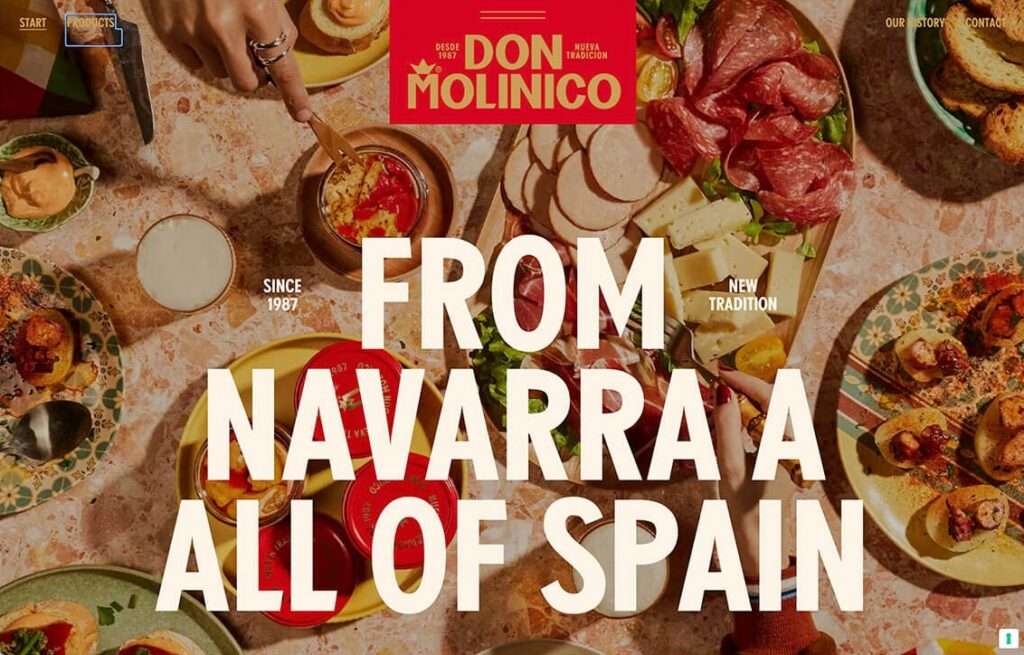
Type is no longer just brand expression; it’s proof of decision-making. Generic font pairings signal default thinking. Intentional typography signals point of view. Type has always communicated personality. What it’s increasingly communicating in 2026 is effort. A distinctive typeface pairing, especially one that could not have been arrived at by clicking “generate,” tells a visitor that someone made a deliberate choice here. Even more so if the typeface was custom designed. That choice implies a person. That person implies a brand that has opinions.
Variable fonts are finally being used well, allowing type to behave responsively across contexts in ways that feel considered. Editorial-scale hierarchies, where display type carries visual weight and genuinely legible body copy, are replacing the homogenized stacks that made so many 2022-2024 website feel interchangeable.
If your site’s type selection looks like any other websites type choice, you’ve already lost a trust signal you didn’t know you were spending.
#3: Visual Specificity: The End of “Good Enough”
Stock imagery doesn’t just look generic anymore—it actively undermines credibility. Users recognize it instantly. And in that moment, a conclusion is formed: “If they didn’t invest here, where else didn’t they invest?” Stock photography tells have been obvious for years, but the cost for using them in 2026 has landed. Consumers can easily spot the licensed image of “diverse group of people collaborating around a laptop” in a split second. That split second recognition should terrify any brand that still heavily relies on stock imagery. The movie Inception comes to mind; it subconsciously implants the idea that as a company didn’t invest enough to showcase who they actually are.
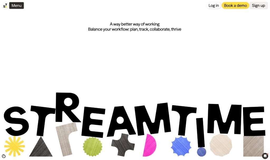
The move is toward visual specificity at every level: custom photography with real faces and real environments, bespoke illustration with a recognizable hand, and AI-generated imagery that is clearly tailored rather than generic. The test is simple: could this belong to another brand? If yes, it’s a problem.
Ironically, the interesting countertrend worth watching is the usage of intentionally imperfect assets. Imagery that has grain, visible texture, hand-drawn elements. Creative that includes imperfect artifacts are outperforming high-gloss stock in sectors where authenticity is the primary driver. Imperfection coupled with intention reads as honesty.
#4: Data as Design: Turning Claims Into Proof
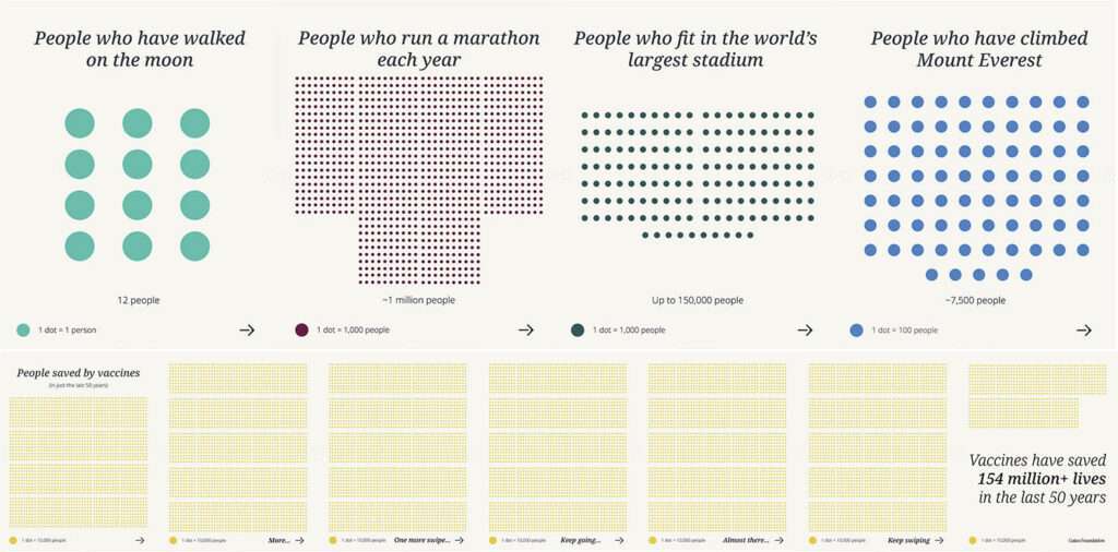
Claim: “We’ve helped over 500 clients.” Evidence: the same claim, but the number visually counts up as you scroll into it or sits inside a geometric illustration that shows distribution by industry or alongside a chart that lets you explore outcomes by sector.
This is one of the cleaner translations of the verification engine concept into a design decision. The shift is treating proof points as design elements rather than copy elements and giving data visual form, motion, and context instead of burying it in a bullet list in the about section.
The psychological principle is straightforward: specificity is credible. A number that breathes is more believable than a number that sits static. A visualization that adds context is more trustworthy than one that simply asserts. The design isn’t just decorating the data but instead is doing the persuasion work the data alone couldn’t communicate fully.
#5: Material Depth: The Return of Digital Substance
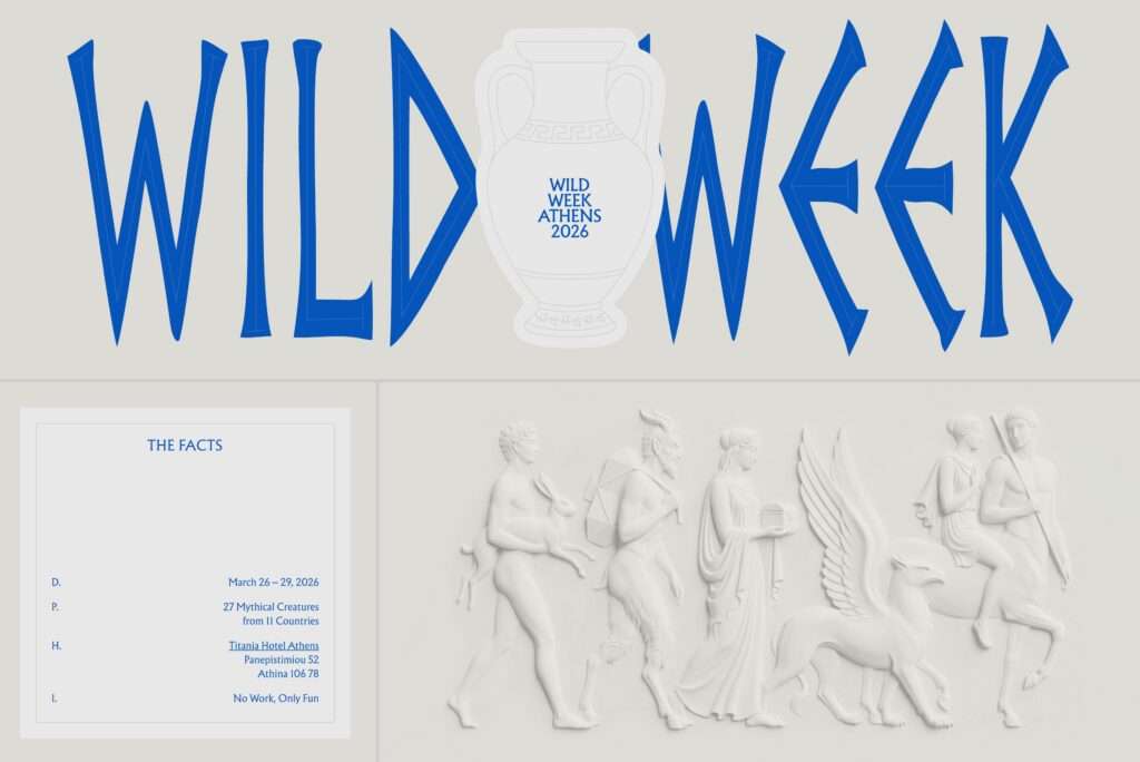
After a decade of radical flatness, there’s a meaningful return to depth in 2026. Flat UI stripped interfaces of the visual metaphors that used to anchor trust: surfaces, weight, structure. Pure flatness works beautifully when the brand equity is enormous. For everyone else, it can read as weightless.
What’s coming back isn’t skeuomorphism. It’s depth that has been considered: layered compositions, subtle shadows that imply stacking, texture used as atmosphere rather than decoration. UI that feels like it has mass. The signal is subtle but real: when something feels like it has physical properties, it reads as having substance.. This is exactly the inference you want consumers making about your brand.
#6: Information Density: The “Nothing to Hide” Interface
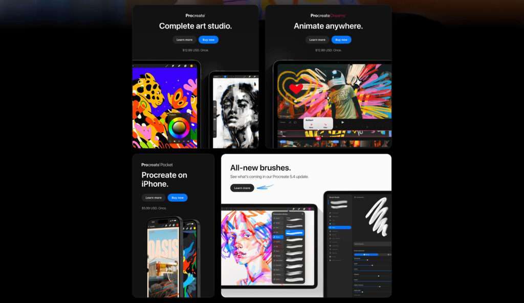
The era of the vague, minimalist homepage is fading. The single-message hero, massive headline, vague sub-headline, one button, nothing else until you scroll, is losing ground to layouts that show you more, faster. Bento-style grids and information-dense above-the-fold designs are gaining traction as a layout philosophy that says: we have enough to show you that we don’t need to make you hunt for it.
Testimonials, credentials, feature previews, proof points, and case study callouts surfacing in the first scroll, not as clutter, but as organized density to create verification scaffolding.Visitors arrive ready to evaluate. Give them the evidence in the interface. Don’t make them work to figure out if you’re credible.
#7: The Authenticity Premium in an AI-Saturated World
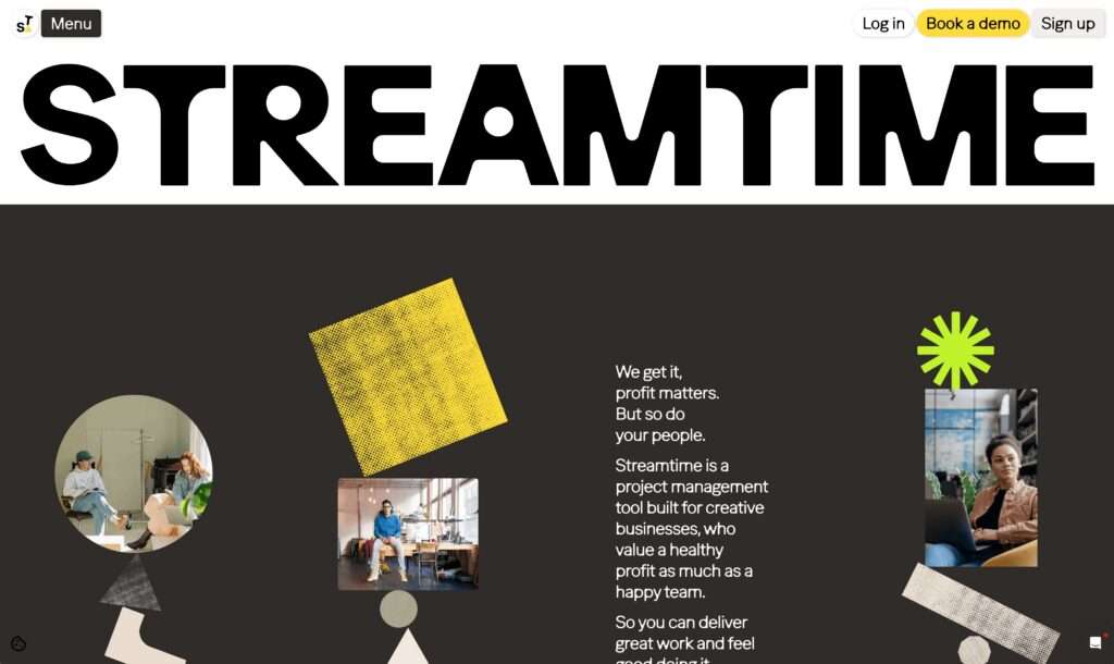
As AI-generated content floods the internet, something interesting is happening: Real work is becoming more valuable, not less. This one requires a slightly longer view. As AI-generated visual content reaches saturation (it will probably arrive faster than most people are accounting for), the comparative trust signal shifts entirely to anything that reads as genuinely made. Custom illustration, original typefaces, bespoke UI components, photography that couldn’t’t have been generated: these will carry a premium that is partly aesthetic and partly moral.
Paradoxically, the flood of AI-produced creative work makes genuine design investment more valuable, not less. When every competitor’s site looks like it was assembled in forty-five minutes, the site that was built clearly, that has decisions in it, that has a point of view, that has details that only exist because someone cared enough to put them there, stands out in a way that’s difficult to quantify but impossible to miss.
This isn’t an argument against using AI in the creative process. It’s an argument for understanding what it can’t replace: judgment, specificity, and the legible evidence of craft.
Underneath the surface, all seven points are answering the same design brief:
Give consumers something they can use to verify that you’re worth trusting. Not something beautiful for its own sake. Something that functions as evidence.
The micro-interactions prove you sweat the details. The typography proves you have taste. The specific visuals prove you invested. The data visualization proves you have results. The material depth proves you have substance. The layout density proves you have nothing to hide. And the authenticity premium proves you’re real.
Brands that treat design as decorative will keep wondering why performance isn’t improving. Brands that treat design as argument, as proof, as the visual layer of their credibility, will find the work speaks before their copy ever loads.
That’s the brief. The trends are just showing us where the bar currently sits. If you’re rethinking how your website performs in this new environment, it’s worth a conversation.
The Latest
In The Red
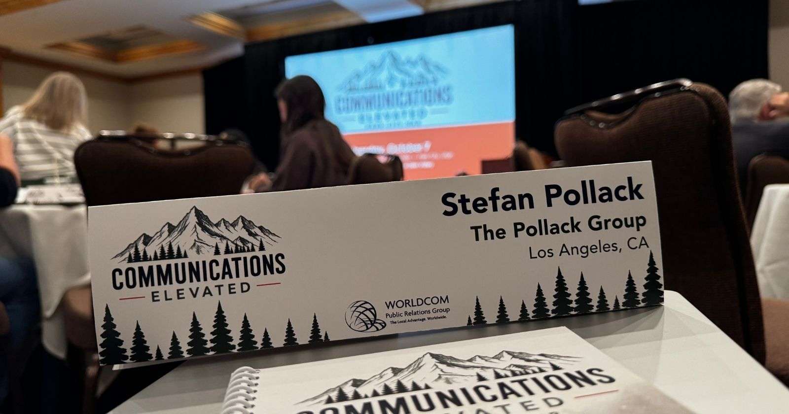
Elevated: Reflections on the Worldcom Public Relations Group’s North American Regional Meeting in Park City, Utah
Stefan Pollack reflects on the Worldcom Public Relations Group's North American Region meeting in Park City, Utah.

In The Red
Consumers Don’t Want Ads. They Want a Reason to Show Up.
Marketers chase attention. The challenge is figuring out how to earn it when consumers can scroll past a brand in a fraction of a second.

In The Red
Sited Visibility Index: Who’s Brewing Up the Best Fall?
The Pumpkin Spice Latte season is here, and we examined the AI search visibility of some of the nation's leading coffee brands.
Solutions
Some communications challenges call for a more focused approach. The Pollack Group’s proprietary solutions combine decades of communications experience with specialized methodologies, technology and audience intelligence to help organizations solve specific business and reputation challenges. From strengthening messaging and preparing for a crisis to understanding audiences, elevating leaders and measuring how brands appear in AI-driven search, our solutions give organizations practical tools and insights they can put to work.
Leadership Now
Creating leadership platforms that are essential to building audience trust and confidence.